Hi, I’m Dave.
I'm passionate about using design to craft unique stories and build systems that create repeatable, reliable outcomes
As a registered Architect, I understand how to design from first principles, manage multiple stakeholders and how strike a balance between complex ideas, budgets and critical paths to achieve beautiful results - that work!
I've been an Operations Manager for a large eCommerce Business, and a Product Owner for a Media company and I won Best Art Director at ADMAS ad school.
I get it. You need it to look great, be on-brand, it needs to be effective, and have no sticker shock thanks!
Let's work together on your next project!
The Pun Didn't Stop for this Soap Brand
The brief for this soap company was to create a brand for a foaming gel body wash. The concept was to create a brand that helped them stand out from the crowded market. The simple, colourful and playful design and punny branding concept help Foamo's mission to make every shower feel indulgent.
Breaking Bread with a National Community Notice Board Project
Bakers Delight wanted to adopt the concept of Community Notice Boards used in IGA supermarkets for their customers nationwide.
In order to accommodate the wide variety of Bakers Delight store sizes and types, we designed a modular system that allowed each store to customise the look and feel of the board for their community.
It included a digital screen that could be centrally managed by the Head Office in order to display fresh deals and messages, as well as a place for the store to share their own info/pictures/notices.
A Tasteful Identity for a Whisky Club
The Fellowship of WHISKY Enthusiasts The fellowship of Whisky Enthusiasts was looking for a brand identity that captures their aim to "Surprise and Delight" their exclusive members. Being passionate about whisky myself, I created a brand that embodied the timelessness of the product, with a similarly timeless logo. The challenge was ensuring the brand identity spoke to the exclusiveness of the club whilst also being modern and youthful.
The scope included a logo and two tasting books. The concept for this identity is the natural colour of Whisky, and charts that are used to identify how dark they are. The Courier New typeface was a special request.
Elevating the look of a Local Artisan
The Scope of this client was to create a brand identity for their passion project.
Developing a Visual Identity for a Property Consulting Company
This brand identity was created for the Director of a Development Consulting Company.
The brief here started out pretty simply- "I want it to be purple"
After digging a little deeper, I was able to uncover more about the business, the people running it, their focus and their mission. As Civil Engineers and Project managers, they work with developers and other consultants to deliver large-scale projects. Hence, the vision for the brand was to create a stand-out, professional and bold identity.
A Campaign to Attract National Brands to a Unique OOH Network
This national media network has a large footprint affording advertisers the opportunity to reach audiences in over 1000 local supermarkets all around Australia.
Every year, this company was able to get thousands of local businesses to utilise this product, but they had not yet found national advertisers that would take a large campaign across multiple locations.
This EDM campaign was created to introduce the concept to national brands and the agencies that represent them. This was able to give us an opportunity to meet with all of the major media and advertising companies across Australia.
Professional Presentations that Persuade
This presentation was created as a Media Kit that formed part of the sales and marketing materials for a Print and Digital Out of Home network. The company did not have an existing brand strategy, so this brand concept, logo and colours were created as part of this brief. Until this document was created, documents were created in-house, often cobbled together by the sales staff in Powerpoint, without a unified direction.
This presentation presented the network as professional, capable and valuable to a more sophisticated customer.
Shhh, This Release Plan is Yet to be Released
Working with the Developer on creating marketing material for their subdivision project, I wanted to elevate the aesthetic of the release plan designs that are common in the industry. This concept provides the information in a visually-pleasing manner, with a brand identity that can be carried through to other marketing media used in the project.
Marketing Materials for Property Development
Existing brand elements were used to create a suite of marketing assets the developer of this large subdivision project could use as part of their existing strategy.
Deliverables included a soft flyer, a responsive email and a CTA used at the end of a video.
Infographics and Photographs for Social Media
Creating fun Infographics and photographs for this Instagram account is a great way to express creative freedom.
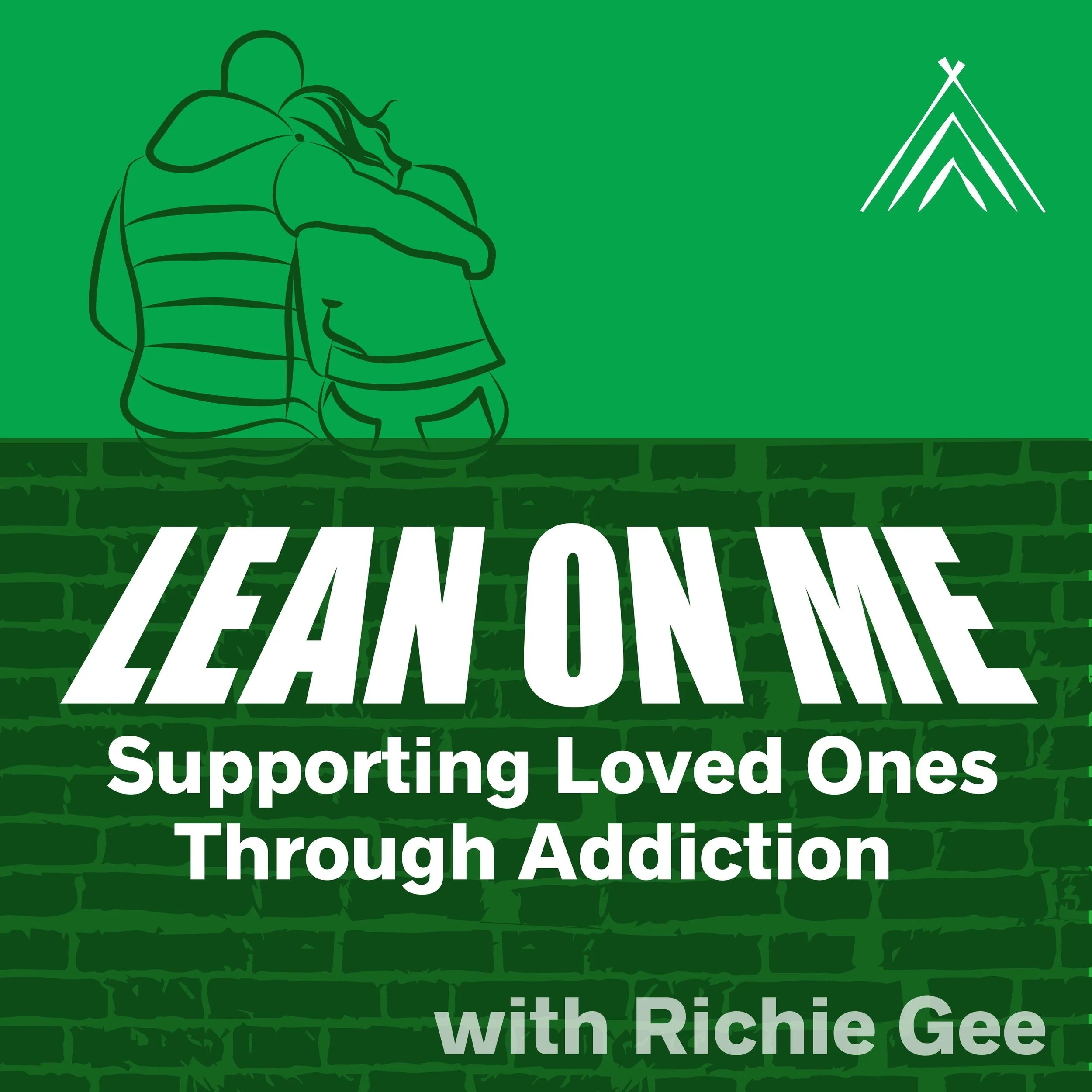
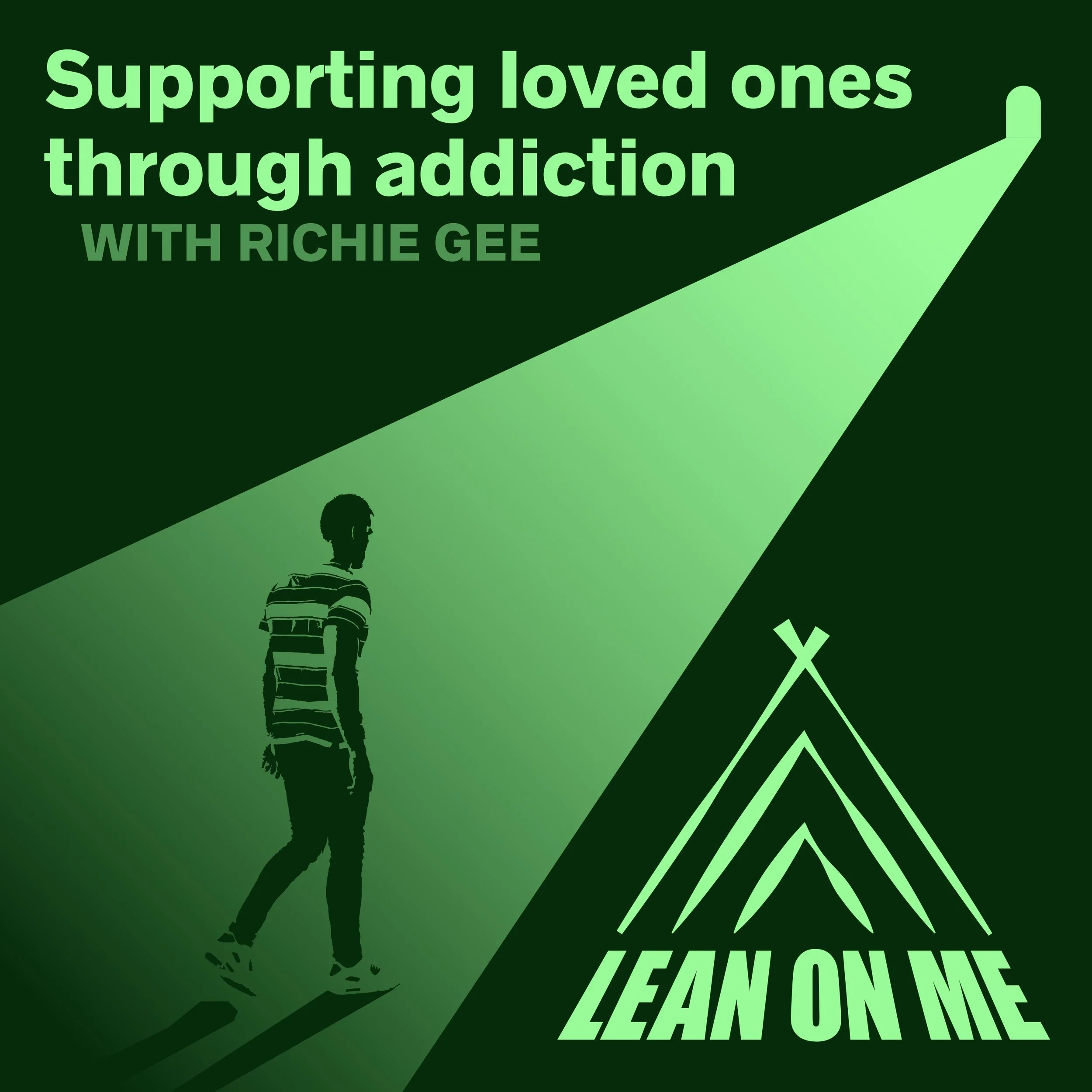
Loved Ones of Addicts Sharing Their Stories
These vector Illustrations were created to promote a podcast where real people share their stories about the impact that drug addiction has had on someone they love. It creates a community of support and shared experiences that provide a safe space for people working through addiction.
“Not Your Typical Lawyers Logo"
Lawyers tend to prefer simple work mark brand identities. This design married the concept of "reliable" with "unique" by presenting a modern take on traditional corporate logo design, with the idea that the process of mediation is to be a representative of two parties bringing together a resolution for a broken relationship.


